The colours of our home hold importance to how we feel every day. Colours provide more than a decorative purpose; they enhance our emotions and play a part in making us feel secure and happy. Many of us have invested more time into transforming our homes in 2020, one cancelled holiday after another we’ve had time to create the ideal place to live, work and play. The colour trends that are predicted to take over 2021 have been inspired by our need for peace in our daily lives, as it’s more important than ever to look after our wellbeing. This year, colour trends are shifting away from strong hues into more soothing and calming neutrals. The Pantone’s 2021 Colours of the Year have been revealed as Ultimate Gray and Illuminating. Based off these alone we can see the main theme this year is positivity and fortitude, “we need to feel that everything is going to get brighter – this is essential to the human spirit.”
To reveal the 2021 interior colour trends you need in your home, interior design expert at My Job Quote, Kane Hughes, has shared everything you need to know.
- Sunny hues
With illuminating being one of the colours of the year, you should expect bursts of sunshine brimming in popularity. Sunny hues will be favourable this year, inspiring us to be hopeful that things will get brighter. Incorporate yellow into muted colour schemes to create a relaxing environment boosted with a brightness hue. The colour will stimulate your mind and revive each room of your house.
- Rich nature
Soft green is illustrative of nature. Shades of green can range from vivid birch to fern green, they instantly connect us to the environment. Many find this colour soothing and peaceful due to its therapeutic properties. Rich green shades work well in home offices or rooms with technology to balance out the ‘artificial’ feeling.
- Grounded tones
Dulux named their Colour of the Year 2021 as Brave Ground, ‘this will allow us to find certainty in the strength from the very ground beneath our feet’. Many have criticized beige as being a dull colour, but this year will prove how versatile this shade can be when paired with similar and soft shades for a relaxed and inviting feel. When contrasted with brighter tones such as forest green, it will provide a richer experience for you to enjoy in your homes.
- Mulberry
During times of uncertainty, we often look for warmer tones to provide us with comfort. Mulberry is a cool colour with a plummy blue undertone. It has the power to shape high impact spaces as the shade is associated with revelry and luxury. This shade can instantly bring more depth to a subtle white room. Mulberry reflects light beautifully, whether you paint a feature wall or the ceiling too, it can bring a splash of punchy colour to your room.
- Earth colours
Earthy colours can be a great backdrop for a living room. Earthy colours have natural and soothing hues, and for 2021 it is set to be a key player in home décor palettes. The natural, cool beige of grounded tones paired with a faint green undertone portrays a calming earthy quality. Earthy colours splashed on a feature wall in your living room has an emotional attachment. We need a relaxed influence of colour which not only remind us of nature but has an emotive reflection of the world around us.
- Rustic
Rustic colours will help to create an uplifting and nourishing setting. Whilst bringing a reminder of the world’s cultural heritage to your home, rustic hues hold rich traditions and values. Think natural clay, earthy browns and light masala – these shades create a unified palette to create an ambient atmosphere. Chalky white walls look great paired with rustic colours, when paired with rustic coloured textured cushions and layered rugs. It can work in any room in any style of home.
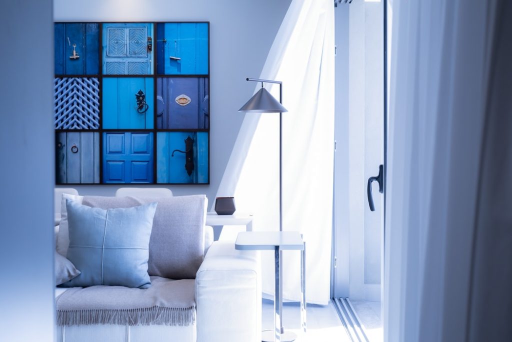
- Pastel
Pastel colours look especially nice in bedrooms and bathrooms. The key colours to watch in 2021 are baby blue and pale pink. Pastel colours can spruce up rooms with the added pop of colours, muted yellow pairs well with pastel blue furniture and colourful accent pillows. Subtle hints of greenery will complete the room without overcrowding.
The colours chose for this year all resemble a feeling of comfort. Welcoming these into your home will be steer your emotions towards a new year and fresh start. Experiment with the different shades to create a palette that works right for your home.