For anyone looking for decorating inspiration for the A/W months ahead, premium paint brand Colourtrend has unveiled five new shades in its latest Colour Edit Volume 2 – including dramatic hue of the moment, Pine Marten.
The decadent shade – a deep, rich brown – has been chosen alongside the brand’s striking Esker Ridge, enchanting Temperance, complimentary Reinvent and the vibrant Tuscan Tile for The Colour Edit Volume 2 picks, as the most trending shades of the season.
Overseen by Colourtrend’s team of experts, the palette combines a mixture of rich and calming colours to help create a warm atmosphere within the home alongside a balanced colour scheme.
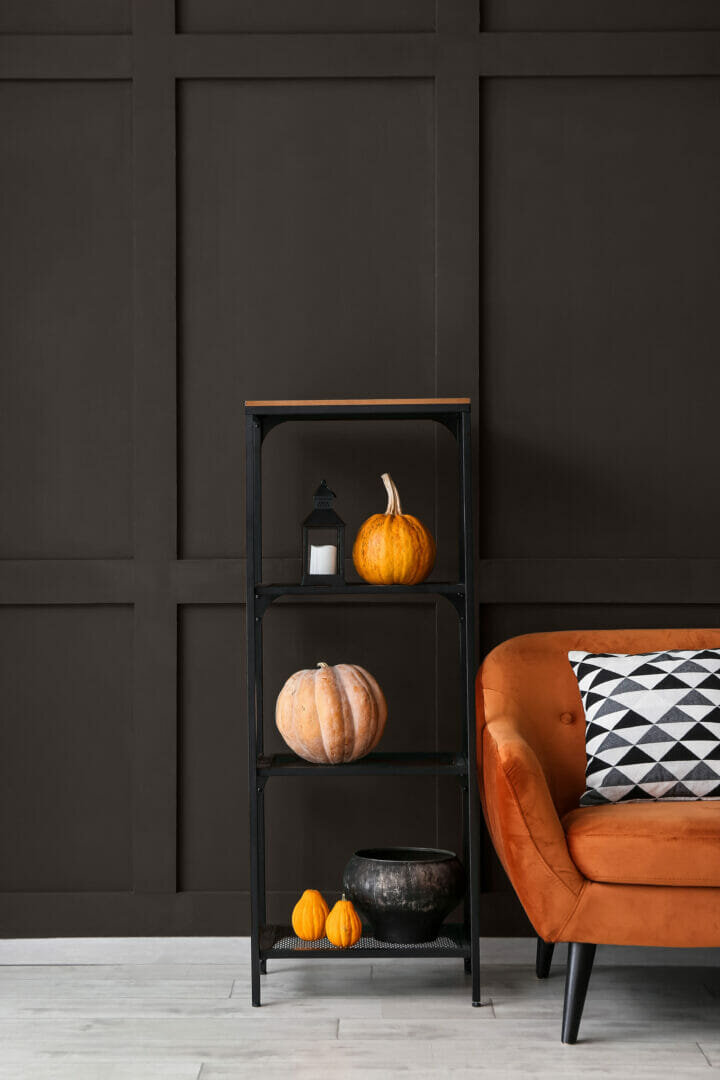
The paint supplier’s hero shade has been selected as Pine Marten, an intriguing yet grounding shade of brown that is perfect for a feature wall or panelling.
Ellen McEvoy, Head of Marketing and Digital at Colourtrend said: “The palette our experts created combines deeper tones with calming colours to create a balanced scheme.
“This is one of our most exciting and inspiring Colour Edits yet. As well as warmer hues, biophilic design (bringing the outside in), a trend that will long continue, is also echoed in this palette.
“Our hero shade Pine Marten is a striking and enveloping colour that’s the perfect alternative to statement options such as navy and greens.
“The other four shades within our Colour Edit Volume 2 have also been carefully curated to complement one another, nodding to the 1960s with a modern twist.”
HOW TO INCORPORATE THESE STUNNING SHADES INTO YOUR SPACE
Colour: Pine Marten: (Walls)
Pine Marten may seem like a dramatic choice for your project, but it is a wonderful addition that creates depth and warmth in your space. If you’re looking to elevate your bedroom, colour drenching (painting your walls, ceiling, and woodwork) with Pine Marten evokes a sense of calm and sophistication.
“Pine Marten is rich enveloping colour that adds warmth and depth to any scheme.” describes Interior architect and designer Ger Cooney. “Ideal as a statement wall, used on furniture or for a dramatic look on a ceiling. A striking alternative to statement options such as navy and greens.”
Or for a wow factor that will have your house guests not wanting to leave, Pine Marten is a stunning shade for an eclectic living room. Pair with a variety of colours and textures, this room will be the most popular space in your home.
Colour: Eskar Ridge (Walls)
Esker Ridge is a stone neutral that resembles the landscape of Ireland. A beautiful calming tone that will ground your space, or a perfect partner to balance more colourful hues.
Colour: Temperance (Panelling)
Temperance, a light warmth of earthy grey, works in almost any space. Use it to brighten your dining room and balance with some subtle deep textiles. Or pair it with Reinvent to bring an extra layer of depth to your walls.
Tara Smart, manager of the Colourtrend Paint and Wallpaper Store in Swords, Dublin, says Temperance “works well as an all over woodwork colour as it works with most colours on walls. Very popular with those who like to stay away from clinical white woodwork. It also equally works well as an all over colour because its contemporary grey with no yellow undertones.”
Colour: Tuscan Tile (Walls)
With terracotta and brick colours on the rise, Tuscan Tile is a beautiful earthy pigment that will create a sense of tranquillity. A rich deep terracotta colour that can be used to add a pop of colour in a space to add a rustic feel.
“A rich injection of colour that creates instant warmth and interest. Used as an effective accent colour or in cosier nooks on panelling. Combines well with warmer neutrals such as Esker Ridge and Reinvent” says Ger Cooney.
Reinvent, a colour which offers versatility with accent colours as well as being an effective option for a main wall. Ideal for a cosy scheme for living room and bedroom spaces, as well as cabinets and furniture. It has a rich timeless quality that can combine with options such as Temperance and Esker Ridge
Emma Edmond, interior designer and colour consultant at Stillorgan Décor, loves using tonal colours in interiors. These types of colours make it very easy to decorate any room.“ Reinvent is a beautiful deep shade, perfect for kitchen cabinets.”
INSPIRATION AND ADVICE
Looking for more colour inspiration? Check out Colourtrend’s blog, The Trend follow their social channels @colourtrendpaints.
To see the full Colourtrend range or find your nearest UK Colourtrend stockist, visit: https://www.colourtrend.co.uk